
Even in our highly-digitized world, a well-designed, engaging brochure is still one of the best ways to catch the attention of your target audience. But, in order to successfully promote or advertise your company, services, products, or events, your brochure needs to stand out.
Fortunately, with so many options — from different folds to paper finishes — you’re sure to create an eye-catching brochure design that cuts through the clutter. Get inspired for your next project with these beautiful examples.
The first step to any successful brochure design is selecting the type of fold you’d like to use. And with so many options, it can be difficult to choose. Take a look at the following designs for ideas on how you can use different folding techniques to create a unique, dynamic piece.
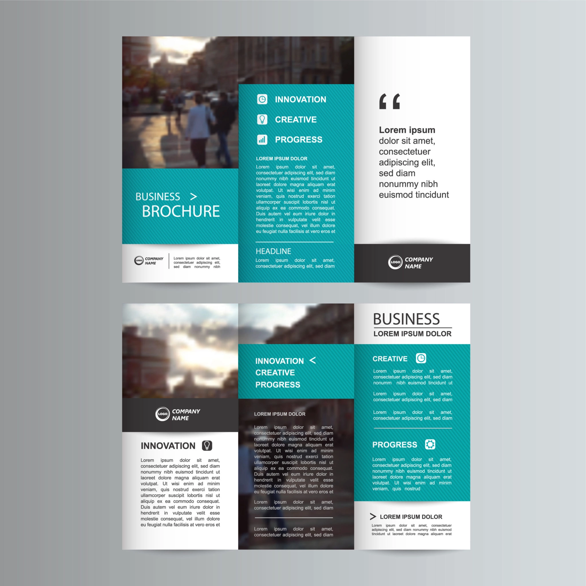
By far one of the most popular choices for brochure design are tri-fold brochures, allowing you to include an abundance of information while still being easy to digest. They are typically created by folding a standard-size 8 ½ x 11 paper into thirds to create six panels, which fits perfectly into an envelope.
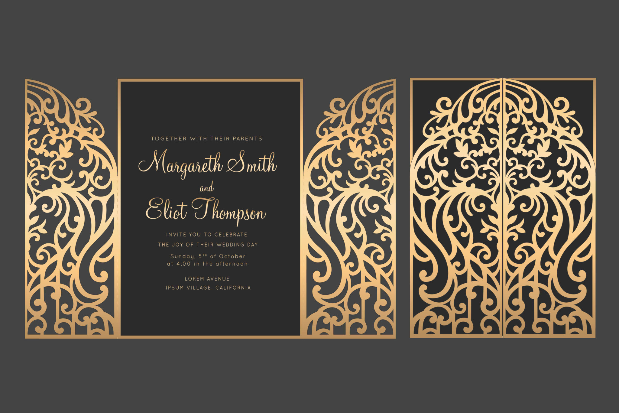
Grab the attention of your readers instantly with a gate fold brochure. Featuring two sides that fold inward, this style allows the brochure to be opened like doors, inviting the audience to discover the content that lives inside. When opened, the two panels on either side are a great place to include information without taking away from the wide center panel, thus making it a perfect area for a large image.
Half-fold brochures, also known as bi-fold, can open up a whole world of creative possibilities. Unlike the tri-fold, half-fold brochures are only folded in one place, down the center of the paper, allowing you to use larger images without the interruption of a crease. They can also be made in a variety of sizes or stacked and bound to create a beautiful catalog or booklet.
One great benefit of a z-fold brochure is its flexible design options and versatility. Much like the tri-fold brochure, a z-fold has plenty of room for necessary information and images. However, with the z-fold brochure, the design can span the entire sheet of paper or can be broken up into six individual panels, allowing for simplification of design and the ability to include everything your audience is looking for.
In addition to choosing a fold design, there are many other ways to create a memorable marketing piece that will stand out from the rest. Here are just a few ideas.
Take your brochure to the next level with a die cut. From adding creative edges to your half-fold brochure or creating a window on the front of your tri-fold, die cuts are a great option to add a unique twist to any project.
Another great aspect of designing your own brochure is the ability to select the type of paper that works best for your project. Choose from different thicknesses, textures, and finishing types such as matte, uncoated, or one of the newest advancements, synthetic stock paper which acts as a laminate.
Ready to get started on your next brochure design? Stop by your nearest PostNet and we’ll help you every step of the way.
