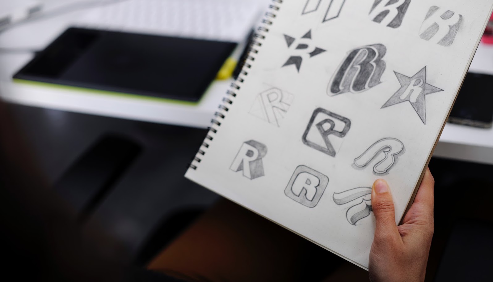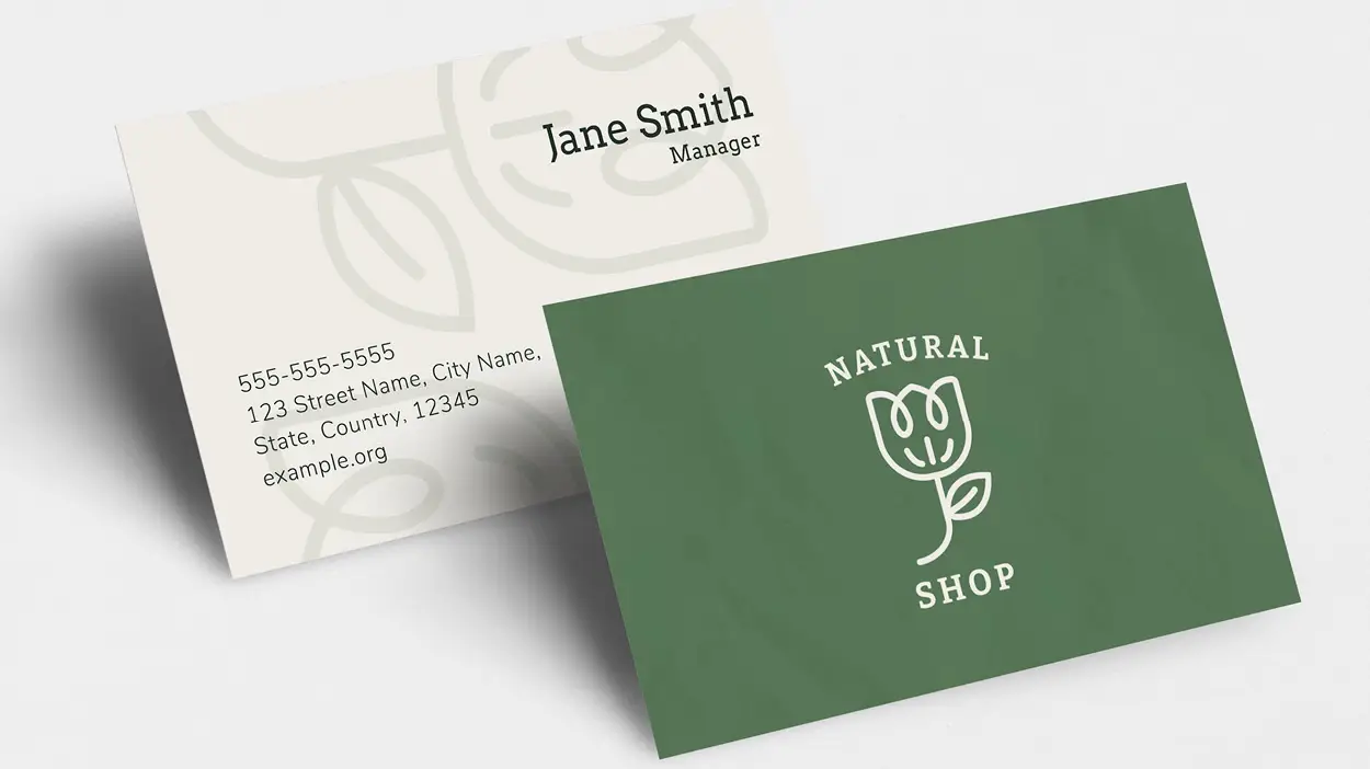

A logo is an important factor for any business — big or small. It introduces your brand, provides a visual representation of your company’s identity, and is oftentimes what people base their first impressions off of—all within a few seconds! With this in mind, we’ve put together a list of the top Dos and Don’ts of great logo design to help get you started creating something memorable.
Think about the demographics and personalities of who you’re trying to attract. Are they playful? Sophisticated? Old? Young? What activities do they like? Make a list of their important attributes, interests, and personality traits to help guide your design.
Just because you’re a dentist doesn’t mean your logo needs to have a tooth on it. Shy away from the clichés of your industry and don’t worry that people won’t understand abstract shapes; logos gain meaning over time. The Nike Swoosh was a simple representation of speed and movement before it became synonymous with a global brand.
If this is your company, you probably already know quite a bit about its personality. However, it never hurts to sit down and brainstorm what makes the business unique. Consider your services, beliefs and values, as well as what colors, imagery, and words represent the company.
Staying up-to-date on the different trends and styles of logos can be helpful and ignite your creativity but, if you rely to heavily on trends your logo will look outdated quickly. Focus on making your design timeless while staying true to your brand’s overarching personality.
While you’re creating your logo, remember: simplicity is key. This will help your logo be easy to read, straightforward, and quickly understood by your audience. Start by only using three colors or less, choose a font that is legible, and play with the space and balance between the different design components. Also, make sure to think about whether or not your logo will still work when it’s used in just one color and when it’s reduced to a smaller size.
When it comes to logo design, the opposite of simplicity is confusing — and that’s the last thing you want your logo to be. To keep from overwhelming your audience, avoid using too many elements, colors, fonts, or words. And as a general rule of thumb, don’t use photography.
Help your logo stand out from the competition by making it different from the rest. Think about what makes your company special and use those ideas to find an image or design that both best represents your services and will be memorable to those who see it.
Gathering inspiration from other logos is a great way to start your design processes but replicating someone else’s work will cause you to lose credibility and be confused with other brands. To avoid any unintentional duplication, stay away from clipart, downloadable designs, or stock art and graphics that you can get from the web.
Once you’ve come up with a few different ideas or iterations of your logo, ask friends, colleagues, and potential customers for their input. Some questions for them to consider are: is it memorable? Is it unique? Can you tell what it is in just a few seconds? Does it appeal to you or who we’re selling to?
Even if you don’t hit a homerun the first time around, don’t lose hope. Designing a successful logo can be challenging and can take a few tries to get right. But, we’re here to help! If you’re having a hard time making your company’s logo exactly what you envisioned, stop by and consult with our graphic designers. We can give you plenty of ideas and designs that will truly make your company stand out.
If you’re ready to get your brand new logo out to the masses with professionally printed marketing materials, our print center has you covered. Stop by your local PostNet today and bring that logo to life!


